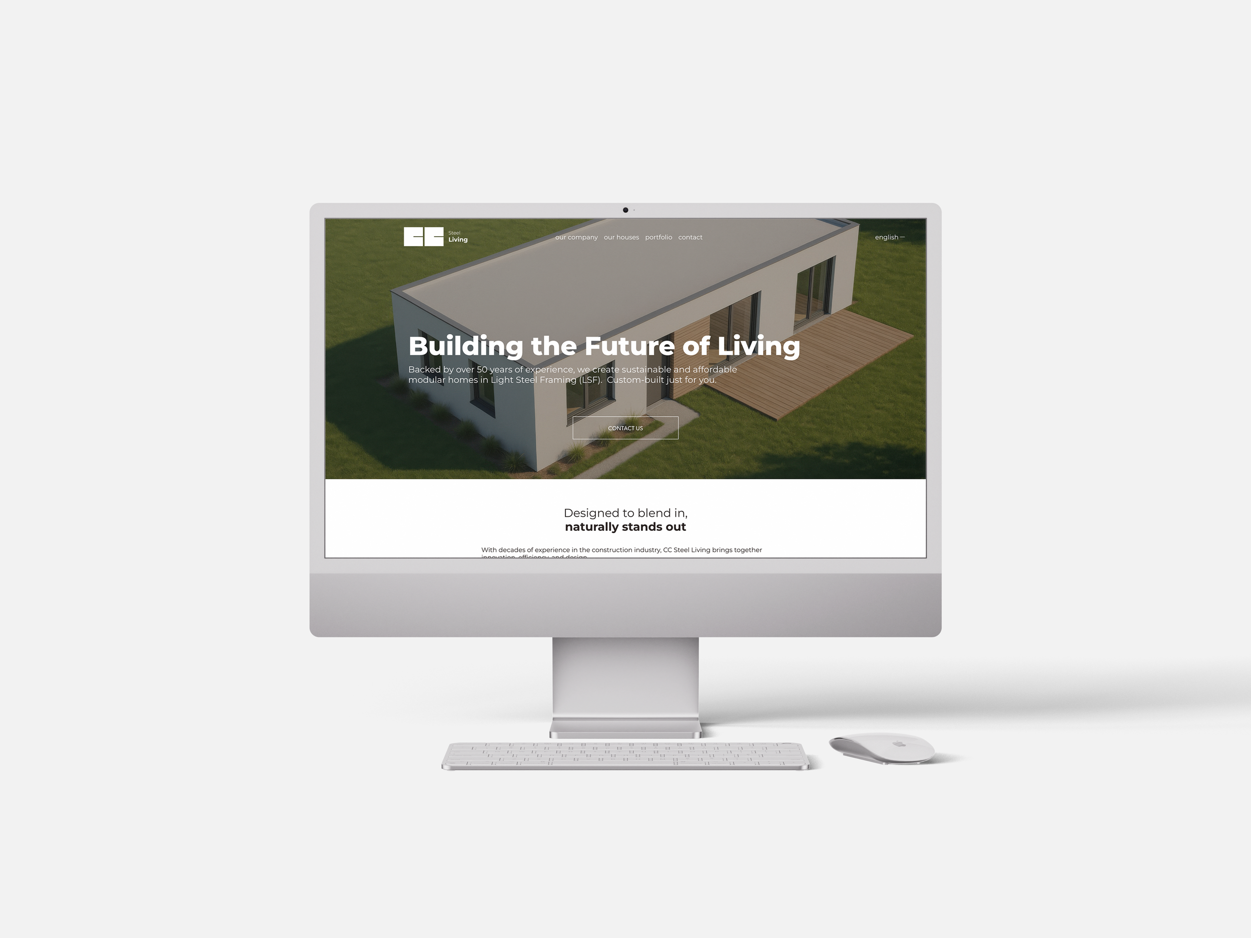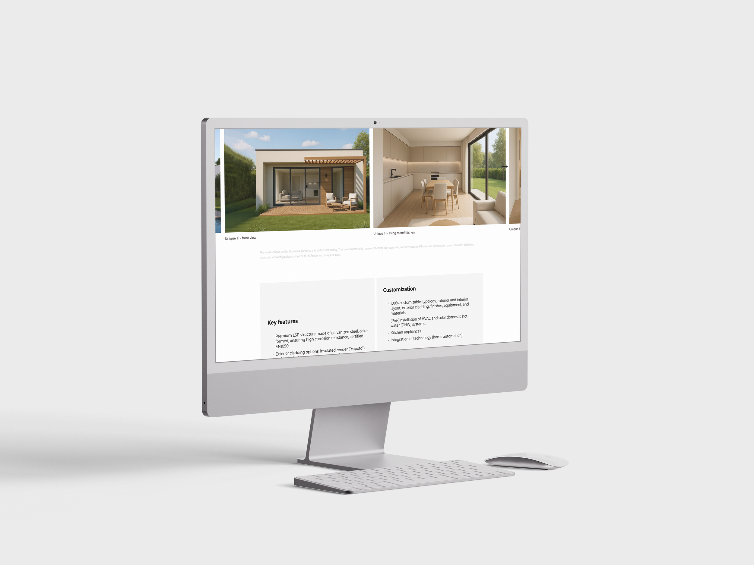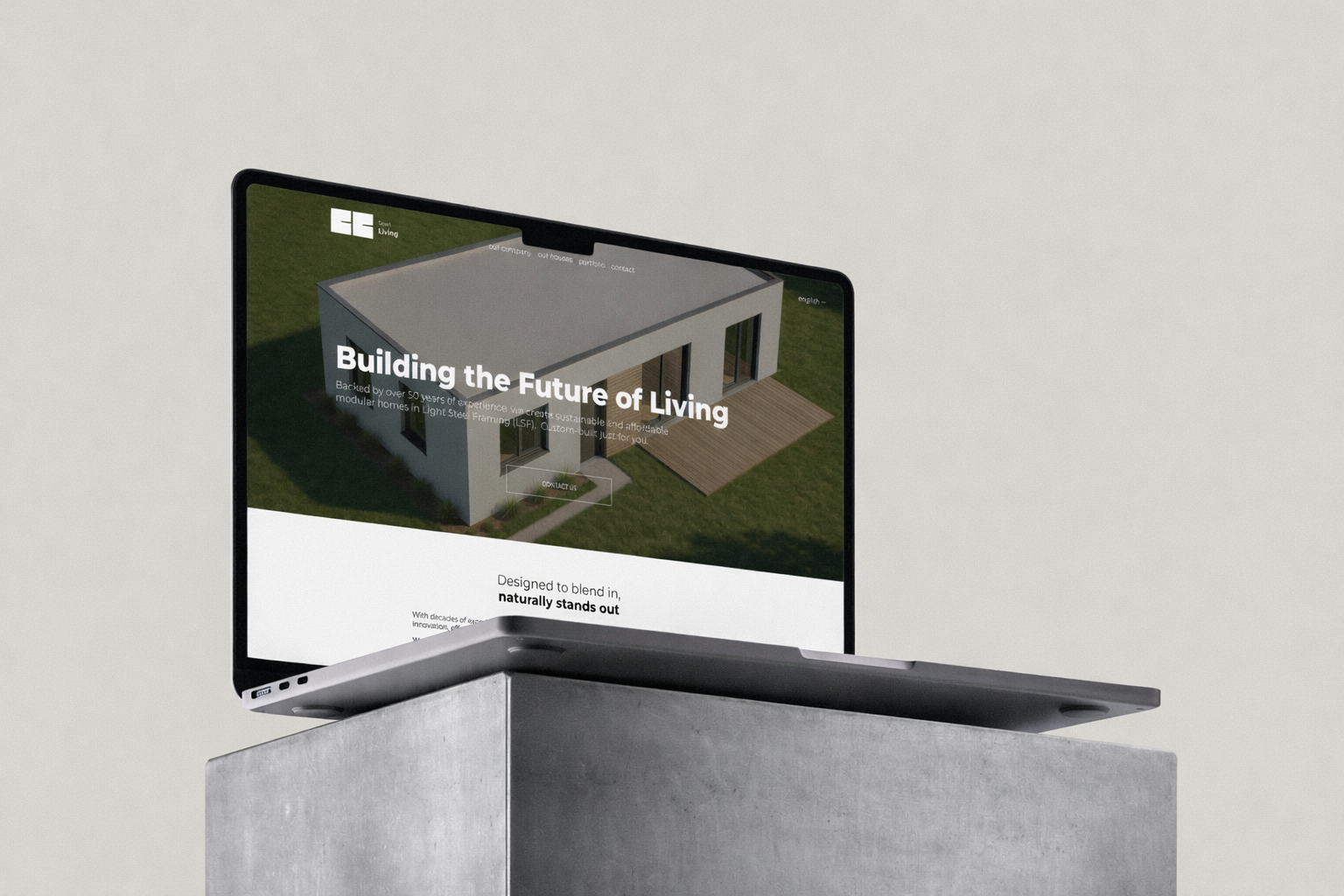
cc logo and website
CC Steel Living is born from the union between the solidity of materials and the lightness of the living experience. “Steel” represents not only the material itself, but also the strength, trust, and longevity of the structures. “Living” brings balance, speaking of comfort, well-being,
and lifestyle.
It is a brand that unites the technical with the emotional, the robust with the essential.

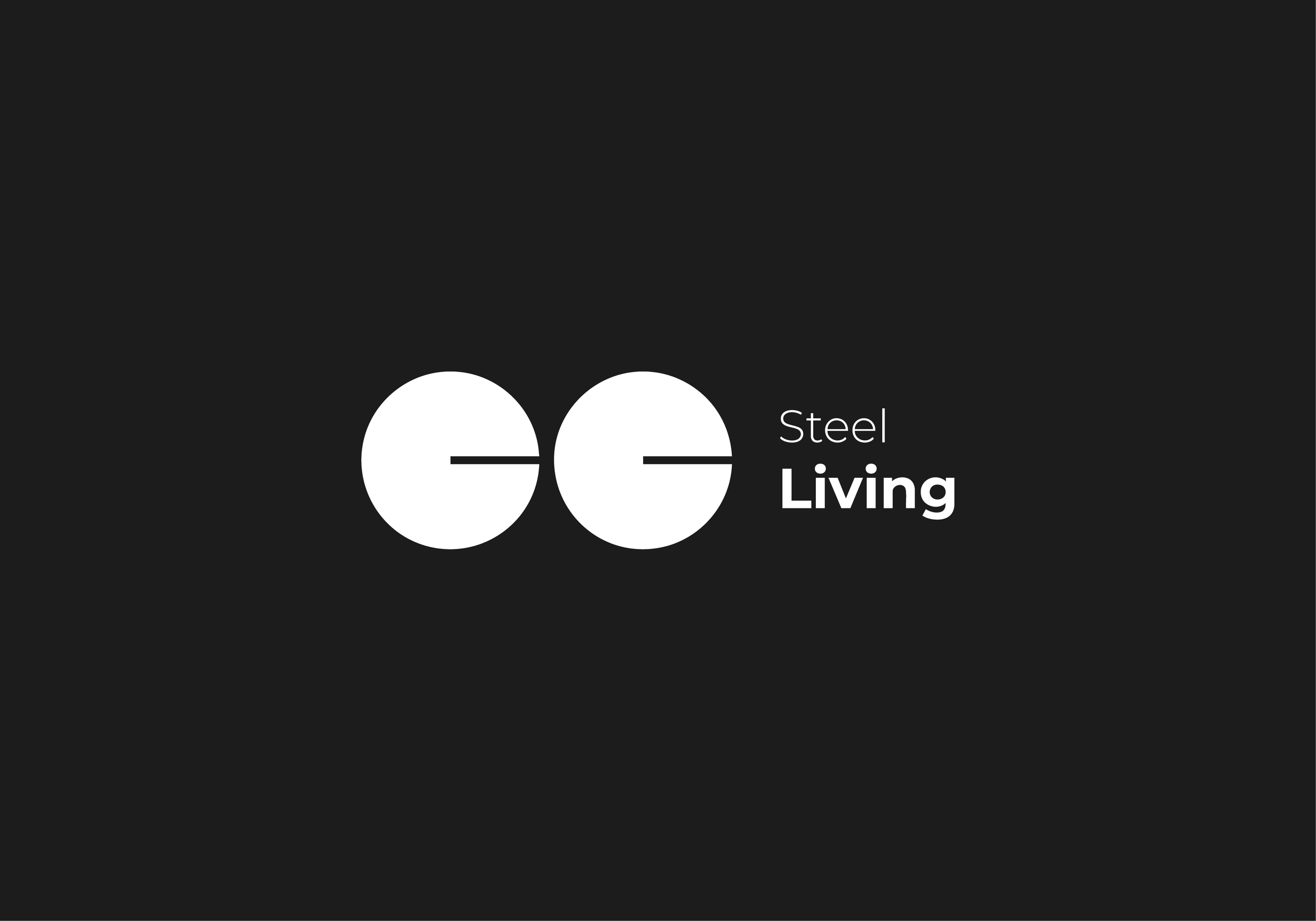

The CC Steel Living logo highlights a dynamic and adaptable approach, capable of adjusting to different contexts without losing its core identity. This graphic flexibility is a visual metaphor for the very essence of the brand, which combines robustness with the ability to reinvent itself and integrate into diverse environments.
CC Steel Living adapts to each person’s space and lifestyle, while always maintaining its strong and innovative essence.
This concept shows how the flexibility of the logo not only enriches the brand’s visual identity, but also reflects the philosophy of CC Steel Living:
to offer solutions that combine robustness and design, always with a focus on integration and continuous evolution.
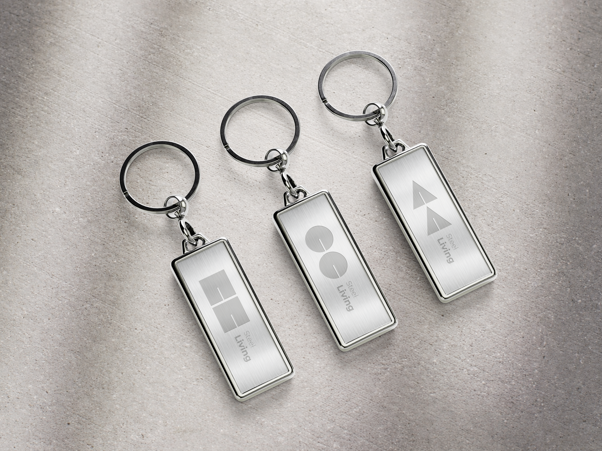
Square Shapes
Stability and Precision.
They evoke a sense of solidity and clarity, reflecting a commitment to an organized and balanced structure.
Circular Shapes
Softness and Harmony.
They convey warmth and integration, highlighting the more human side and the brand’s adaptability to its environment.
Triangular Shapes
Dynamism and Innovation.
Indicative of progress and movement, these shapes suggest an advanced, contemporary vision that is open to new trends.